Website design mistakes are more costly than most business owners realise. A website that looks professional at a glance can still be haemorrhaging potential leads and sales through a handful of preventable design errors that undermine user trust, create friction in the conversion journey, and signal to potential customers — consciously or unconsciously — that your business may not meet their expectations. The most damaging website design mistakes are often subtle: not obvious enough to trigger an immediate redesign, but persistent enough to suppress your conversion rate month after month.
Understanding and fixing these errors is one of the highest-return improvements a business can make to its digital presence. Unlike content marketing or SEO, which take months to compound into significant traffic improvements, fixing critical website design mistakes can produce measurable conversion rate improvements within days of implementation. A business receiving 5,000 monthly visits with a 1.5% conversion rate generates 75 leads per month. Fixing key website design mistakes to move that conversion rate to 2.5% generates 125 leads from identical traffic — a 67% increase in commercial output without a single additional visitor.
This guide covers the most common and most commercially damaging website design mistakes — what they are, why they hurt conversions, and exactly what to do to fix them. These errors appear across business websites of every size and industry, and addressing them systematically is one of the most direct paths to better commercial performance from your existing digital presence.
Want your website audited for conversion-killing design mistakes? Tasknestly’s web design specialists identify and fix the website design mistakes that are costing you leads and build sites that convert. Get your free quote today.
Growing An Online Store?
The right AI marketing tools can automate ads, emails, and product promotion for your store. See which ones are actually worth paying for.
See AI Marketing Tool Reviews →Building Your Site Yourself?
AI coding tools can speed up development dramatically. Compare the best ones before you commit to a stack.
See AI Coding Tools →Your Site Should Be Converting More
Small fixes only go so far — Tasknestly builds and optimizes full websites designed to convert visitors into customers.
Get Website Services →Table of Contents
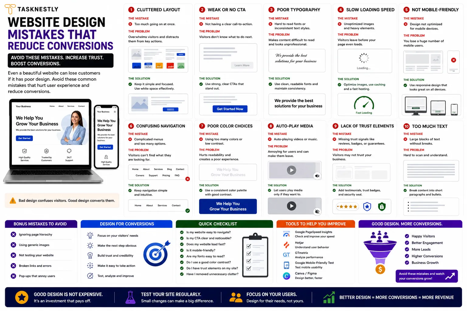
Website Design Mistake 1: No Clear Value Proposition Above the Fold
The most universally damaging of all website design mistakes is failing to communicate a clear, specific value proposition in the first five seconds of a visitor’s experience. Research consistently shows that visitors make their stay-or-leave decision within seconds of arriving on a page. If your homepage headline is vague (“Welcome to Our Website,” “Your Trusted Partner,” “Solutions for Success”), your visitor has no reason to invest more time — and they leave.
This oversight costs businesses an enormous number of potential leads because it happens before any other conversion element has a chance to work. Your social proof, your service details, your CTAs — none of them matter if the visitor decides there is nothing here for them before scrolling far enough to see them.
How to Fix This Website Design Mistake
Replace vague headlines with specific, benefit-led statements that immediately answer the visitor’s question: “What can this business do for me?” A strong headline names who you help, what problem you solve, or what outcome you deliver — in plain language, not industry jargon. Test your headline by asking someone unfamiliar with your business to spend five seconds on your homepage and describe what your company does. If they cannot, your headline is one of the website design mistakes costing you conversions.
Growing An Online Store?
The right AI marketing tools can automate ads, emails, and product promotion for your store. See which ones are actually worth paying for.
See AI Marketing Tool Reviews →Building Your Site Yourself?
AI coding tools can speed up development dramatically. Compare the best ones before you commit to a stack.
See AI Coding Tools →Your Site Should Be Converting More
Small fixes only go so far — Tasknestly builds and optimizes full websites designed to convert visitors into customers.
Get Website Services →Website Design Mistake 2: Weak or Missing Calls to Action
Weak, vague, or absent calls to action are website design mistakes that appear on the majority of small business websites. A potential customer who has read your homepage, understood your offer, and decided they want to proceed should not have to search for how to take the next step. If your CTA buttons say “Submit,” “Click Here,” or “Learn More” — or if they are buried at the bottom of a long page — these are website design mistakes that are letting warm prospects go cold.
The best-performing CTAs are specific, benefit-led, and placed at every logical decision point throughout the page. “Get My Free Quote,” “Book My Strategy Call,” and “Start My Free Trial” consistently outperform generic alternatives. Fixing this requires reviewing every page on your site and ensuring each one has at least one prominent, specific CTA that tells the visitor exactly what they will receive by clicking.
Growing An Online Store?
The right AI marketing tools can automate ads, emails, and product promotion for your store. See which ones are actually worth paying for.
See AI Marketing Tool Reviews →Building Your Site Yourself?
AI coding tools can speed up development dramatically. Compare the best ones before you commit to a stack.
See AI Coding Tools →Your Site Should Be Converting More
Small fixes only go so far — Tasknestly builds and optimizes full websites designed to convert visitors into customers.
Get Website Services →Website Design Mistake 3: Slow Page Load Speed
Slow load speed is one of the most technically driven website design mistakes — and one of the most commercially damaging. Google’s research shows that as page load time increases from one second to five seconds, the probability of a mobile visitor bouncing increases by 90%. For any business running paid advertising, slow load speed burns ad budget before a visitor has even seen your content.
Fixing this category of website design mistakes involves: compressing and converting images to WebP format, enabling browser caching, reducing and deferring JavaScript, and using a CDN to serve assets from geographically close servers. Run your site through Google PageSpeed Insights and treat any mobile score below 60 as urgent.
Growing An Online Store?
The right AI marketing tools can automate ads, emails, and product promotion for your store. See which ones are actually worth paying for.
See AI Marketing Tool Reviews →Building Your Site Yourself?
AI coding tools can speed up development dramatically. Compare the best ones before you commit to a stack.
See AI Coding Tools →Your Site Should Be Converting More
Small fixes only go so far — Tasknestly builds and optimizes full websites designed to convert visitors into customers.
Get Website Services →Website Design Mistake 4: Poor Mobile Experience
Designing for desktop and treating mobile as an afterthought is one of the most prevalent design errors in 2026 — despite the fact that mobile accounts for the majority of web traffic globally. A website that looks excellent on a 27-inch monitor but is difficult to navigate on a smartphone is not “mostly” good — it is failing for the majority of its visitors.
Common mobile website design mistakes include: text too small to read without zooming, navigation menus that are difficult to use with a thumb, forms with fields too small to type in comfortably, and CTA buttons too small to tap accurately. These errors do not just frustrate visitors — they signal that the business does not understand or care about the experience of mobile users, which is a trust signal that works against your brand.
For independent reviews of tools that help identify and fix mobile design issues, TechBothQ covers the best mobile testing and optimisation platforms available in 2026.
Growing An Online Store?
The right AI marketing tools can automate ads, emails, and product promotion for your store. See which ones are actually worth paying for.
See AI Marketing Tool Reviews →Building Your Site Yourself?
AI coding tools can speed up development dramatically. Compare the best ones before you commit to a stack.
See AI Coding Tools →Your Site Should Be Converting More
Small fixes only go so far — Tasknestly builds and optimizes full websites designed to convert visitors into customers.
Get Website Services →Website Design Mistake 5: Cluttered or Confusing Navigation
Navigation is the skeleton of your website’s user experience, and navigation-related errors create the confusion and frustration that causes visitors to leave without converting. When your navigation has too many items, uses unclear labels, or buries important pages in confusing dropdown structures, visitors cannot find what they are looking for — which is a fundamental website design mistake that undermines every other conversion element on the site.
Best practice navigation eliminates these website design mistakes by: limiting main navigation to five to seven items, using plain-language labels that describe what the visitor will find rather than internal terminology your business uses, prioritising your most important conversion pages (Contact, Services, Pricing) in the navigation, and including a clear CTA button in the top right of the navigation bar on every page. These fixes address the most common navigation errors without requiring a full site rebuild.
Let Tasknestly fix the design mistakes that are costing you leads. Our web development and digital marketing team identifies your most costly website design mistakes and implements the fixes that produce the fastest conversion improvement. Book your free quote.
Growing An Online Store?
The right AI marketing tools can automate ads, emails, and product promotion for your store. See which ones are actually worth paying for.
See AI Marketing Tool Reviews →Building Your Site Yourself?
AI coding tools can speed up development dramatically. Compare the best ones before you commit to a stack.
See AI Coding Tools →Your Site Should Be Converting More
Small fixes only go so far — Tasknestly builds and optimizes full websites designed to convert visitors into customers.
Get Website Services →Website Design Mistake 6: Insufficient Social Proof
A lack of visible, credible social proof is one of the most trust-damaging design errors a business can make. Visitors who are new to your brand have no reason to trust you initially — and in a digital environment where they have been exposed to unreliable businesses and misleading marketing, their default scepticism is higher than ever. Social proof — testimonials, reviews, client logos, case study results, and verified ratings — is what breaks down that scepticism and gives visitors the confidence to take action.
Website design mistakes in the social proof category include: having no testimonials at all, displaying generic praise without specific outcomes, burying testimonials at the bottom of a long page where few visitors reach them, and using unverified quote text without names, photos, or company affiliations that lend credibility. Fixing these website design mistakes means placing your strongest, most specific testimonials — with measurable outcomes and real client details — directly below your hero section where every visitor will see them.
Growing An Online Store?
The right AI marketing tools can automate ads, emails, and product promotion for your store. See which ones are actually worth paying for.
See AI Marketing Tool Reviews →Building Your Site Yourself?
AI coding tools can speed up development dramatically. Compare the best ones before you commit to a stack.
See AI Coding Tools →Your Site Should Be Converting More
Small fixes only go so far — Tasknestly builds and optimizes full websites designed to convert visitors into customers.
Get Website Services →Website Design Mistake 7: Too Many Competing Objectives
A website page that tries to do everything simultaneously — sell a product, capture an email, promote a webinar, showcase the team, and display a blog — does none of these things effectively. This creates decision paralysis: when visitors face too many competing options, they often choose none of them. The most effective pages have a single primary objective and a single primary CTA, with every other element supporting that objective rather than competing with it.
This website design mistake is particularly common on homepages, where the desire to showcase everything the business offers results in a page that communicates nothing clearly. The fix requires defining the single most important action you want a homepage visitor to take and restructuring the page around that action — removing or subordinating everything that does not contribute directly to it.
Growing An Online Store?
The right AI marketing tools can automate ads, emails, and product promotion for your store. See which ones are actually worth paying for.
See AI Marketing Tool Reviews →Building Your Site Yourself?
AI coding tools can speed up development dramatically. Compare the best ones before you commit to a stack.
See AI Coding Tools →Your Site Should Be Converting More
Small fixes only go so far — Tasknestly builds and optimizes full websites designed to convert visitors into customers.
Get Website Services →Website Design Mistake 8: No Trust Signals Beyond Testimonials
Testimonials are important social proof — but comprehensive trust-building on a website requires multiple layers of trust signals, and the absence of these additional signals is one of the more subtle design errors that reduces conversion rate without being immediately obvious.
Additional trust signals that address this category of website design mistakes include: displaying a physical address and phone number prominently (signals the business is real and accountable), showing industry accreditations, certifications, or memberships (signals professional standards), using professional photography of your team rather than stock images (signals authenticity), displaying clear privacy policies and security badges near forms and checkout (reduces data privacy anxiety), and showing media mentions or press coverage if available (signals third-party validation).
Combining strong trust signals with professional branding services and a well-built website eliminates the website design mistakes that undermine credibility and creates a digital presence that converts at the highest possible rate.
Growing An Online Store?
The right AI marketing tools can automate ads, emails, and product promotion for your store. See which ones are actually worth paying for.
See AI Marketing Tool Reviews →Building Your Site Yourself?
AI coding tools can speed up development dramatically. Compare the best ones before you commit to a stack.
See AI Coding Tools →Your Site Should Be Converting More
Small fixes only go so far — Tasknestly builds and optimizes full websites designed to convert visitors into customers.
Get Website Services →Website Design Mistakes in Colour, Typography, and Accessibility
Beyond the structural and messaging website design mistakes covered above, there are important aesthetic and accessibility errors that quietly undermine conversion rate and user trust.
Colour Contrast and Readability Errors
Low colour contrast between text and background is one of the most common website design mistakes that affects both accessibility and conversion. When body text is light grey on a white background, or dark text appears over a busy background image, visitors struggle to read your content — and the cognitive effort required to parse the text creates friction that reduces engagement and conversion. The WCAG accessibility guidelines recommend a minimum contrast ratio of 4.5:1 for body text. Running your site’s colour combinations through a contrast checker tool takes minutes and can reveal website design mistakes that affect a significant proportion of your visitors.
Typography Mistakes That Reduce Readability
Typography-related website design mistakes are common on sites that prioritise aesthetics over legibility. Body text smaller than 16 pixels forces mobile users to zoom to read. Line heights below 1.5 create dense, difficult-to-parse paragraphs that cause readers to abandon the page. Using more than two or three font families creates visual inconsistency that signals lack of design polish. And loading multiple font weights and styles from external sources adds page weight that contributes to the slow load speed website design mistakes covered earlier. Each of these typography errors reduces the time visitors spend engaged with your content — which directly suppresses both SEO performance and conversion rate.
Accessibility as a Conversion Issue
Accessibility website design mistakes affect more visitors than most businesses realise. Approximately 15% of the global population has some form of disability that affects how they interact with digital content. Screen reader compatibility, keyboard navigation, descriptive image alt text, and video captions are not just legal and ethical requirements in many jurisdictions — they are also good conversion design practices that improve the experience for all users, not just those with disabilities. Google also treats many accessibility signals as quality indicators, meaning website design mistakes in accessibility directly influence search ranking performance.
Addressing these website design mistakes alongside the structural and messaging errors covered earlier creates a comprehensively optimised website that converts better for a broader range of visitors — maximising the commercial return from every visit your marketing efforts generate.
Growing An Online Store?
The right AI marketing tools can automate ads, emails, and product promotion for your store. See which ones are actually worth paying for.
See AI Marketing Tool Reviews →Building Your Site Yourself?
AI coding tools can speed up development dramatically. Compare the best ones before you commit to a stack.
See AI Coding Tools →Your Site Should Be Converting More
Small fixes only go so far — Tasknestly builds and optimizes full websites designed to convert visitors into customers.
Get Website Services →Common Website Design Mistakes: A Quick Reference Audit
Use this checklist to identify the website design mistakes currently affecting your own site:
| Website Design Mistake | Quick Fix | Priority |
|---|---|---|
| Vague homepage headline | Rewrite with specific benefit and target audience | Critical |
| No CTA above the fold | Add specific CTA button in hero section | Critical |
| Mobile load time over 3 seconds | Compress images, defer JS, enable caching | Critical |
| Navigation more than 7 items | Consolidate to most important pages | High |
| No testimonials above the fold | Move best testimonial directly below hero | High |
| Generic CTA button text (“Submit”) | Rewrite with specific benefit (“Get My Free Quote”) | High |
| Multiple competing CTAs on one page | Identify primary goal, remove or subordinate others | High |
| No contact info visible without scrolling | Add phone number to header or hero | Medium |
| Stock photography on team page | Replace with professional photography | Medium |
| No mobile usability testing | Run Google Mobile-Friendly Test and fix errors | Critical |
Top Tools to Help You Identify and Fix Website Design Mistakes
- Google PageSpeed Insights — Identifies speed-related website design mistakes with specific, prioritised recommendations for mobile and desktop.
- Hotjar — Heatmaps and session recordings that reveal exactly which website design mistakes are causing visitors to leave — showing where they scroll to, where they click, and where they drop off.
- Google Search Console — Mobile Usability report surfaces website design mistakes affecting how Google reads and ranks your pages on mobile devices.
Growing An Online Store?
The right AI marketing tools can automate ads, emails, and product promotion for your store. See which ones are actually worth paying for.
See AI Marketing Tool Reviews →Building Your Site Yourself?
AI coding tools can speed up development dramatically. Compare the best ones before you commit to a stack.
See AI Coding Tools →Your Site Should Be Converting More
Small fixes only go so far — Tasknestly builds and optimizes full websites designed to convert visitors into customers.
Get Website Services →Frequently Asked Questions: Website Design Mistakes
| Question | Answer |
|---|---|
| What are the most common website design mistakes? | The most commercially damaging website design mistakes are: vague above-the-fold headlines, weak or missing CTAs, slow page load speed, poor mobile experience, confusing navigation, insufficient social proof, and too many competing objectives on a single page. |
| How do website design mistakes affect conversion rate? | Website design mistakes create friction, undermine trust, and prevent visitors from finding what they need. Each unaddressed design error reduces the proportion of visitors who take the desired action — compounding across every visit to produce significant commercial underperformance. |
| How can I identify the website design mistakes on my site? | Use Google PageSpeed Insights for speed issues, Hotjar for behaviour analysis, Google Search Console for mobile usability errors, and an honest usability test with someone unfamiliar with your business to identify clarity and navigation website design mistakes. |
| Can I fix website design mistakes myself? | Many website design mistakes — headline rewriting, CTA improvement, testimonial placement, navigation simplification — can be fixed without a developer. Technical mistakes like page speed issues and mobile responsiveness typically require developer support for complete resolution. |
| How long does it take to fix website design mistakes? | Quick-win fixes (headline, CTA copy, testimonial placement) can be implemented in hours. Technical fixes (speed optimisation, mobile responsiveness) typically take one to three days of developer time. The conversion rate improvements from fixing critical website design mistakes can be visible within the first week. |
| Do website design mistakes affect SEO? | Yes. Website design mistakes that increase bounce rate, reduce dwell time, and suppress mobile performance all negatively influence the engagement signals that Google uses as indirect ranking quality indicators. Fixing website design mistakes improves both user experience and search performance simultaneously. |
| Which website design mistakes should I fix first? | Fix website design mistakes in order of their conversion impact: headline clarity first, then page speed, then CTA optimisation, then social proof placement, then navigation simplification. This prioritisation sequence produces the fastest measurable improvement in commercial outcomes. |
Growing An Online Store?
The right AI marketing tools can automate ads, emails, and product promotion for your store. See which ones are actually worth paying for.
See AI Marketing Tool Reviews →Building Your Site Yourself?
AI coding tools can speed up development dramatically. Compare the best ones before you commit to a stack.
See AI Coding Tools →Your Site Should Be Converting More
Small fixes only go so far — Tasknestly builds and optimizes full websites designed to convert visitors into customers.
Get Website Services →Conclusion: Fix Your Website Design Mistakes and Convert More of the Traffic You Already Have
These design errors are silent revenue killers — they operate invisibly, suppressing the commercial performance of every marketing pound you invest in driving traffic to your site. Identifying and fixing them is therefore one of the most commercially efficient improvements available, because it improves returns from traffic you are already receiving rather than requiring additional investment to acquire.
Start by running your site through Google PageSpeed Insights for speed issues, Hotjar for behaviour analysis, and the quick-reference checklist in this guide for structural and messaging errors. Fix the most critical website design mistakes first — headline clarity, load speed, and CTA strength — and then move through the list systematically. Each fix compounds with the others, producing a progressively higher-converting website from the same traffic investment and the same audience you are already working hard to attract.
If you want expert help identifying and fixing the website design mistakes affecting your conversion rate, Tasknestly’s web design and development specialists are ready. Get your free quote today and let us identify, prioritise, and eliminate the website design mistakes that are costing your business its best leads every single month.
Growing An Online Store?
The right AI marketing tools can automate ads, emails, and product promotion for your store. See which ones are actually worth paying for.
See AI Marketing Tool Reviews →Building Your Site Yourself?
AI coding tools can speed up development dramatically. Compare the best ones before you commit to a stack.
See AI Coding Tools →Your Site Should Be Converting More
Small fixes only go so far — Tasknestly builds and optimizes full websites designed to convert visitors into customers.
Get Website Services →Grow With Tasknestly
Subscribe to the Tasknestly newsletter and get the latest tips on websites, SEO, social media, and digital growth.