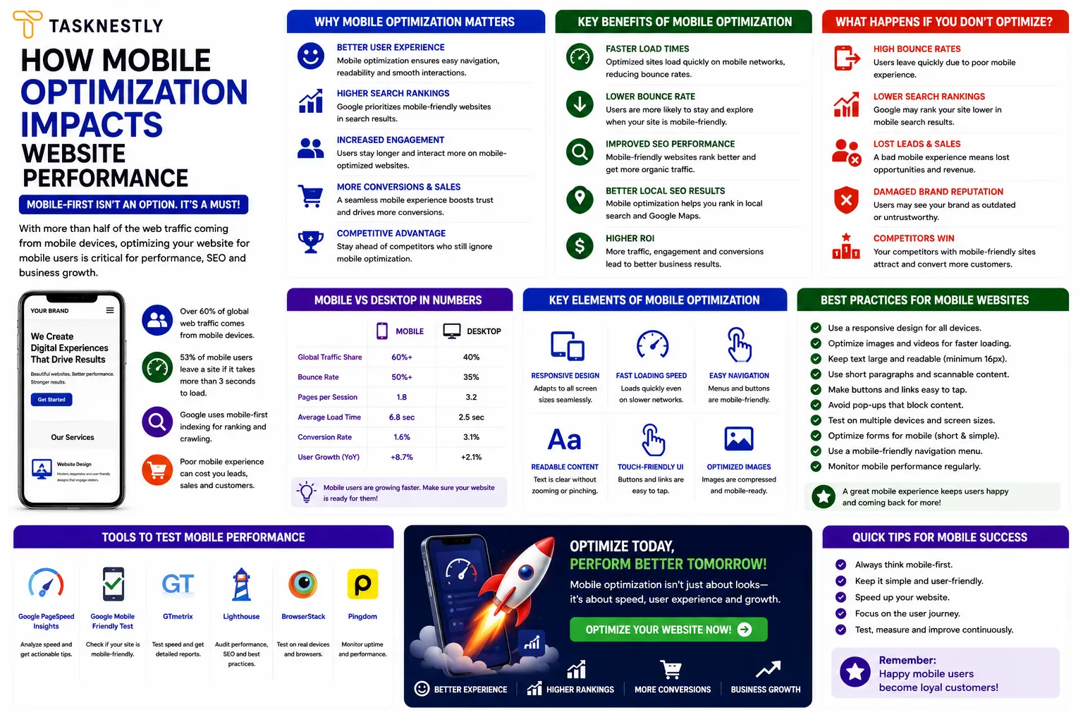
Optimising for mobile is no longer a feature of advanced web development — it is the baseline expectation for any website that wants to rank in search, retain visitors, and convert traffic in 2026. The shift from desktop-first to mobile-first internet use happened years ago, but many business websites still treat mobile optimization as an afterthought rather than the primary design and development consideration it has become.
The commercial stakes of poor mobile optimization are significant and quantified. Google switched to mobile-first indexing in 2019 — meaning it now uses your mobile site as the primary version for ranking and indexing, not your desktop version. If your mobile optimization is poor, your rankings suffer across all search — not just on mobile devices. Beyond SEO, mobile optimization directly impacts user experience: 53% of mobile site visits are abandoned when pages take longer than three seconds to load, and mobile users who encounter friction in navigation, forms, or checkout abandon at dramatically higher rates than desktop users.
This guide covers everything you need to know about mobile optimization in 2026 — how it impacts SEO, user experience, and conversion rate; the specific mobile optimization improvements that deliver the greatest commercial return; and how to audit and improve your site’s mobile performance systematically. Whether you are building a new website or improving an existing one, mobile optimization is the technical investment with the broadest and most direct commercial impact available.
Need mobile optimization built into your website from the ground up? Tasknestly’s web development team builds mobile-first websites engineered for performance, SEO, and conversion on every device. Get your free quote today.
Growing An Online Store?
The right AI marketing tools can automate ads, emails, and product promotion for your store. See which ones are actually worth paying for.
See AI Marketing Tool Reviews →Building Your Site Yourself?
AI coding tools can speed up development dramatically. Compare the best ones before you commit to a stack.
See AI Coding Tools →Your Site Should Be Converting More
Small fixes only go so far — Tasknestly builds and optimizes full websites designed to convert visitors into customers.
Get Website Services →Table of Contents
Mobile Optimization and SEO: The Direct Connection
Mobile optimization and search engine performance are inseparable in 2026. Google’s mobile-first indexing means that the quality of your mobile optimization directly determines how Google assesses your site’s content, user experience, and technical quality — and therefore where it ranks in search results.
Mobile-First Indexing Explained
Mobile-first indexing means Google’s crawlers visit and index your site primarily through its mobile version. If your mobile experience is incomplete — if certain content is hidden on mobile, if your page structure differs significantly between mobile and desktop, or if your mobile load speed is significantly slower than desktop — Google sees a lesser version of your site than your desktop users do, and it ranks accordingly.
For businesses that have invested in excellent desktop websites without equivalent attention to mobile optimization, this is a significant problem. Mobile SEO is not separate from your broader SEO strategy — it is the foundation of it. Every SEO improvement you make to your desktop site needs to be replicated and verified on mobile to have its full intended impact.
Core Web Vitals and Mobile Optimization
Google’s Core Web Vitals — the set of user experience metrics that directly influence rankings — are measured primarily on mobile devices. Mobile optimization that improves your Largest Contentful Paint (how quickly main content loads), reduces Cumulative Layout Shift (how stable your layout is during loading), and minimises First Input Delay (how quickly the page responds to interaction) directly improves your Core Web Vitals scores and, by extension, your search rankings.
The most common mobile optimization issues that negatively affect Core Web Vitals are large unoptimised images, render-blocking JavaScript that delays page rendering, excessive third-party scripts, and unstable layouts caused by images or ads loading without reserved dimensions. Addressing these mobile optimization issues is simultaneously an SEO improvement, a UX improvement, and a conversion rate improvement.
Growing An Online Store?
The right AI marketing tools can automate ads, emails, and product promotion for your store. See which ones are actually worth paying for.
See AI Marketing Tool Reviews →Building Your Site Yourself?
AI coding tools can speed up development dramatically. Compare the best ones before you commit to a stack.
See AI Coding Tools →Your Site Should Be Converting More
Small fixes only go so far — Tasknestly builds and optimizes full websites designed to convert visitors into customers.
Get Website Services →Mobile Website Optimization: The User Experience Impact
Beyond SEO, the quality of your mobile experience has a profound and measurable impact on how visitors your website and whether they convert. These are not abstract design preferences — they translate directly into bounce rates, session duration, pages per visit, and ultimately conversion rate.
How to Optimise Website for Mobile: Navigation
Mobile navigation is one of the most frequently mishandled elements of mobile website optimization. Desktop navigation menus — with hover-activated dropdowns, multi-column layouts, and small link targets — do not translate to mobile without significant adaptation. Mobile user experience tips for navigation include: using a hamburger menu that opens into a clear, full-screen or drawer-style menu, making all touch targets at least 44 by 44 pixels (Apple’s minimum recommendation), increasing spacing between links to prevent accidental taps, and placing the most important navigation items at the top of the mobile menu rather than buried in dropdowns.
Mobile Optimization for Typography and Readability
Typography choices that work on desktop often fail on mobile without specific optimization. Mobile website optimization for typography includes: setting body text to a minimum of 16 pixels to ensure readability without zooming, using line heights of at least 1.5 for comfortable reading on small screens, limiting line length to 60 to 70 characters per line (which requires narrower text columns on mobile), and ensuring sufficient contrast between text and background colours for readability in outdoor or bright ambient light conditions.
These typography improvements may seem granular, but they have a direct impact on session duration and content engagement — visitors who find your content difficult to read on mobile leave earlier and engage less, both of which negatively impact your conversion rate and your SEO signals simultaneously.
Growing An Online Store?
The right AI marketing tools can automate ads, emails, and product promotion for your store. See which ones are actually worth paying for.
See AI Marketing Tool Reviews →Building Your Site Yourself?
AI coding tools can speed up development dramatically. Compare the best ones before you commit to a stack.
See AI Coding Tools →Your Site Should Be Converting More
Small fixes only go so far — Tasknestly builds and optimizes full websites designed to convert visitors into customers.
Get Website Services →Mobile-First Website Design: Building for Mobile From the Start
A mobile-first design approach begins with the mobile experience and scales up to desktop, rather than designing for desktop and then adapting downward. It is now the industry standard approach to mobile optimization — and for good reason.
Why Mobile-First Design Produces Better Mobile Optimization
When websites are designed desktop-first and then adapted for mobile, the adaptation process typically involves hiding content, shrinking elements, and rearranging layouts in ways that were not considered during the original design. The result is often a mobile experience that feels like an afterthought — because it is. Mobile-first website design forces a discipline of prioritisation: what is truly essential for the mobile visitor? What content, navigation, and functionality must be front and centre on a 375-pixel screen?
The answers to those questions produce a cleaner, faster, and more focused mobile experience — one that often improves the desktop version too, because the prioritisation discipline it enforces results in less bloat and more clarity across the board. For businesses commissioning a new website or a major redesign, specifying mobile-first website design from the brief stage is one of the most important mobile optimization decisions you can make.
Want a mobile-first website that performs perfectly on every screen size? Tasknestly’s web design specialists and SEO team build mobile-optimised websites that rank higher and convert better. Request your free quote.
Growing An Online Store?
The right AI marketing tools can automate ads, emails, and product promotion for your store. See which ones are actually worth paying for.
See AI Marketing Tool Reviews →Building Your Site Yourself?
AI coding tools can speed up development dramatically. Compare the best ones before you commit to a stack.
See AI Coding Tools →Your Site Should Be Converting More
Small fixes only go so far — Tasknestly builds and optimizes full websites designed to convert visitors into customers.
Get Website Services →Mobile Optimization for Speed: The Highest-Return Technical Improvement
Mobile page speed is the single most commercially significant dimension of mobile optimization. The correlation between mobile load speed and bounce rate is direct and dramatic — and the gap between a fast mobile site and a slow one translates directly into revenue difference.
Key Mobile Speed Optimization Techniques
The most impactful mobile optimization techniques for speed are: compressing and converting images to WebP format (the biggest single source of mobile page weight on most sites), implementing lazy loading for images below the fold, minimising and deferring JavaScript, eliminating unused CSS, using a Content Delivery Network to serve assets from geographically close servers, and enabling browser caching for returning visitors.
Speed performance should be measured separately on mobile vs desktop using Google PageSpeed Insights — which provides a mobile score and a desktop score independently. Mobile scores are almost always lower than desktop scores because mobile devices have less processing power and often operate on slower network connections. A score above 80 on mobile is a reasonable target for most business websites; above 90 is excellent. Scores below 50 on mobile represent a significant mobile optimization deficit that is actively harming both rankings and conversion.
For independent reviews of the best mobile optimization testing tools and performance monitoring platforms available in 2026, TechBothQ provides detailed comparisons of the leading options.
Growing An Online Store?
The right AI marketing tools can automate ads, emails, and product promotion for your store. See which ones are actually worth paying for.
See AI Marketing Tool Reviews →Building Your Site Yourself?
AI coding tools can speed up development dramatically. Compare the best ones before you commit to a stack.
See AI Coding Tools →Your Site Should Be Converting More
Small fixes only go so far — Tasknestly builds and optimizes full websites designed to convert visitors into customers.
Get Website Services →Mobile SEO Optimization: Specific Requirements
Beyond the general mobile optimization improvements that benefit both users and search engines, there are specific mobile SEO optimization requirements that deserve individual attention.
Avoid using interstitials — pop-ups or overlays that cover the main content immediately on page load — on mobile. Google penalises pages on mobile that use intrusive interstitials because they disrupt the mobile user experience significantly. If you use pop-ups for lead generation, configure them to appear after a delay, on exit intent, or on scroll rather than immediately on page load, and ensure they are easy to dismiss on a mobile screen.
Ensure all structured data markup present on your desktop site is also present on your mobile pages. Google’s mobile-first indexing means that structured data only on desktop will not be credited to your rankings. Mobile SEO optimization requires a consistent technical foundation across both versions.
Verify your site’s mobile version in Google Search Console separately from desktop — Search Console provides mobile-specific coverage reports, Core Web Vitals assessments, and mobile usability errors that are distinct from desktop issues. Regular audits in Search Console surface mobile issues — like text too small to read or clickable elements too close together — that are easy to miss in desktop development and testing.
Growing An Online Store?
The right AI marketing tools can automate ads, emails, and product promotion for your store. See which ones are actually worth paying for.
See AI Marketing Tool Reviews →Building Your Site Yourself?
AI coding tools can speed up development dramatically. Compare the best ones before you commit to a stack.
See AI Coding Tools →Your Site Should Be Converting More
Small fixes only go so far — Tasknestly builds and optimizes full websites designed to convert visitors into customers.
Get Website Services →Mobile Optimization for Conversion: Turning Mobile Visitors Into Customers
All the mobile optimization improvements discussed so far — speed, navigation, typography, mobile-first design, mobile SEO optimization — ultimately serve one commercial goal: converting mobile visitors into leads and customers at a higher rate. These specific mobile user experience tips bridge the gap between mobile engagement and mobile conversion.
Mobile forms require special consideration in mobile website optimization. Standard form designs that work on desktop — small text fields, dropdown menus, complex multi-step layouts — create significant friction on mobile. Mobile optimization for forms includes: using large input fields with appropriate keyboard types triggered automatically (numeric keyboards for phone numbers, email keyboards for email fields), enabling autofill for common fields, minimising the number of required fields, and making the submit button large enough to tap comfortably with a thumb.
Mobile checkout optimization is the highest-stakes form of mobile website optimization for ecommerce businesses. Enabling Apple Pay, Google Pay, and other one-tap payment options eliminates the most friction-heavy stage of the mobile purchase journey entirely. Tasknestly’s ecommerce solutions always incorporate checkout mobile optimization as a core component, because the conversion rate difference between a mobile-optimised checkout and a non-optimised one can represent tens of percentage points of abandoned revenue.
Click-to-call buttons are a mobile optimization element that service businesses often overlook. A prominent, tappable phone number that initiates a call directly captures high-intent mobile visitors who prefer to enquire by phone — a segment that converts at a significantly higher rate than form-based enquiries for many service businesses. Pair professional digital marketing strategy with mobile-optimised conversion elements and your mobile traffic becomes a genuine revenue channel rather than a poorly-converting afterthought.
Growing An Online Store?
The right AI marketing tools can automate ads, emails, and product promotion for your store. See which ones are actually worth paying for.
See AI Marketing Tool Reviews →Building Your Site Yourself?
AI coding tools can speed up development dramatically. Compare the best ones before you commit to a stack.
See AI Coding Tools →Your Site Should Be Converting More
Small fixes only go so far — Tasknestly builds and optimizes full websites designed to convert visitors into customers.
Get Website Services →How to Audit Your Website’s Performance on Mobile Devices
Knowing your site needs improvement on mobile is one thing — knowing exactly what to fix and in what priority order is another. A structured audit process lets you identify the specific issues affecting your site’s performance on smaller screens so you can address them methodically rather than guessing.
Start with Google PageSpeed Insights. Enter your URL, select the mobile tab, and review both the score and the specific field data for Core Web Vitals. Pay particular attention to the Largest Contentful Paint score — this measures how quickly your primary content becomes visible on screen and is the metric most directly correlated with perceived load speed. Any LCP above 4.0 seconds is a priority fix. The Opportunities and Diagnostics sections below the score give you a specific, ranked list of fixes with estimated time savings for each.
Next, open Google Search Console and navigate to the Experience section, then Core Web Vitals. This report shows you real-world performance data from actual visitors to your site on real devices — which is often significantly different from the lab-based scores in PageSpeed Insights. Search Console also surfaces specific mobile usability errors under the Mobile Usability report: text too small to read, clickable elements too close together, content wider than screen. Each of these issues has a direct fix, and Search Console will tell you which specific URLs are affected.
Complement these automated tools with manual testing on a real smartphone — not just your most recent high-end device, but an older or mid-range device where performance issues are more apparent. Walk through your site as a first-time visitor: Can you read the homepage headline without zooming? Can you tap the navigation menu without hitting adjacent links? Can you complete your contact form without frustration? Can you find the information you need within three taps? These manual tests surface usability issues that no automated tool will catch, and they are the most honest assessment of what your real visitors experience.
Finally, test your site across multiple browsers on mobile — Chrome, Safari, and Samsung Internet collectively cover the vast majority of smartphone browsing. Cross-browser rendering differences on mobile are more common than on desktop, and an issue that only appears in one browser can still affect a significant proportion of your visitor base. Running through these manual and automated audit steps quarterly gives you the data you need to keep your site performing at its best on the devices your visitors actually use.
Growing An Online Store?
The right AI marketing tools can automate ads, emails, and product promotion for your store. See which ones are actually worth paying for.
See AI Marketing Tool Reviews →Building Your Site Yourself?
AI coding tools can speed up development dramatically. Compare the best ones before you commit to a stack.
See AI Coding Tools →Your Site Should Be Converting More
Small fixes only go so far — Tasknestly builds and optimizes full websites designed to convert visitors into customers.
Get Website Services →Mobile Optimization Across Different Business Types
The mobile optimization priorities that matter most vary somewhat depending on the type of business you operate. Understanding which mobile optimization improvements will have the greatest commercial impact for your specific situation helps you prioritise your investment effectively.
For service businesses — agencies, consultants, tradespeople, professional services firms — the most commercially impactful mobile optimization improvements are fast load speeds, click-to-call buttons, simplified contact forms, and clearly visible contact information. Service business customers on mobile are often high-intent and ready to enquire — the mobile experience just needs to make that enquiry as frictionless as possible. Mobile optimization for service businesses is therefore more about removing barriers than about showcasing content.
For ecommerce businesses, mobile optimization priorities shift toward product discovery and checkout. Fast-loading product images, intuitive filtering and search, large add-to-cart buttons, and one-tap payment options (Apple Pay, Google Pay) are the mobile optimization improvements that translate most directly into revenue. Cart abandonment rates on mobile are significantly higher than on desktop for most ecommerce businesses — almost always due to checkout friction that effective mobile optimization can eliminate.
For content-led businesses — publishers, blogs, educational platforms — mobile optimization priorities centre on readability, fast content loading, and easy navigation between related articles. Large text, generous white space, fast load times, and a clean reading experience are the mobile optimization improvements that keep content readers engaged and returning. Effective mobile optimization for content sites also includes easy social sharing functionality, since mobile readers share content via social media far more frequently than desktop readers.
Top Tools to Help You Improve Your Mobile Optimization
- Google PageSpeed Insights — Measure your mobile and desktop speed scores separately, with specific Core Web Vitals data and prioritised optimization recommendations for each.
- Google Search Console — Monitor mobile usability errors, Core Web Vitals performance on mobile, and mobile-specific indexing issues that may be suppressing your rankings.
- BrowserStack — Test your website across hundreds of real mobile devices and screen sizes to identify mobile optimization issues that only appear on specific hardware or operating systems.
Growing An Online Store?
The right AI marketing tools can automate ads, emails, and product promotion for your store. See which ones are actually worth paying for.
See AI Marketing Tool Reviews →Building Your Site Yourself?
AI coding tools can speed up development dramatically. Compare the best ones before you commit to a stack.
See AI Coding Tools →Your Site Should Be Converting More
Small fixes only go so far — Tasknestly builds and optimizes full websites designed to convert visitors into customers.
Get Website Services →Frequently Asked Questions: Mobile Optimization
| Question | Answer |
|---|---|
| What is mobile optimization and why does it matter? | Mobile optimization is the process of ensuring your website performs excellently on smartphones and tablets — in terms of speed, usability, readability, and conversion. It matters because mobile accounts for the majority of web traffic and Google uses your mobile site as the primary basis for ranking. |
| How does mobile optimization affect SEO? | Mobile optimization directly affects SEO through Google’s mobile-first indexing and Core Web Vitals. Poor mobile optimization suppresses rankings across all search, not just mobile. Improving your mobile site improves your overall search performance simultaneously. |
| What is mobile-first website design? | Mobile-first website design is an approach that starts with the mobile experience and scales up to desktop, rather than designing desktop-first and adapting downward. It produces faster, cleaner, more user-friendly mobile experiences because prioritisation decisions are made with the smallest screen in mind from the start. |
| How do I check my website’s mobile optimization? | Use Google PageSpeed Insights for speed and Core Web Vitals, Google Search Console for mobile usability errors, and BrowserStack or a real smartphone for visual testing. Run these checks monthly as part of your ongoing mobile optimization process. |
| What are the most important mobile optimization improvements to make? | Image compression and WebP conversion, JavaScript minimisation, large touch targets for navigation, legible typography (16px minimum), mobile-friendly forms, and fast server response time are the highest-impact mobile optimization improvements for most business websites. |
| Does mobile optimization affect conversion rates? | Significantly. Faster mobile load speeds, easier navigation, readable typography, and mobile-friendly forms all directly increase mobile conversion rates. Mobile optimization is one of the highest-return technical investments a business website can make. |
| How often should I audit my mobile optimization? | Monthly performance monitoring via PageSpeed Insights and Search Console, with a full mobile UX audit bi-annually or after any significant site update. Mobile optimization is an ongoing process — not a one-time project — because site changes can introduce new mobile issues at any time. |
Growing An Online Store?
The right AI marketing tools can automate ads, emails, and product promotion for your store. See which ones are actually worth paying for.
See AI Marketing Tool Reviews →Building Your Site Yourself?
AI coding tools can speed up development dramatically. Compare the best ones before you commit to a stack.
See AI Coding Tools →Your Site Should Be Converting More
Small fixes only go so far — Tasknestly builds and optimizes full websites designed to convert visitors into customers.
Get Website Services →Conclusion: Mobile Optimization Is Non-Negotiable for Growth in 2026
Mobile optimization is not a technical nicety or a future consideration — it is the present-day commercial reality of how most people access the internet and how Google decides which websites deserve to rank at the top of search results. Businesses that invest in mobile optimization consistently outperform those that do not: in rankings, in session engagement, in conversion rates, and ultimately in revenue.
Start with a Google PageSpeed Insights audit of your mobile performance today. Check your mobile usability report in Search Console. View your own website on a real mobile device and honestly assess whether it delivers the experience your customers deserve. Then prioritise the mobile optimization improvements that will have the greatest impact — typically image compression, JavaScript reduction, and navigation simplification — and implement them systematically.
If you want expert support building or improving your mobile optimization as part of a comprehensive website and SEO strategy, Tasknestly’s web development and SEO team is ready to help. Get your free quote today and let us build the mobile-optimised website your business needs to grow in 2026.
Growing An Online Store?
The right AI marketing tools can automate ads, emails, and product promotion for your store. See which ones are actually worth paying for.
See AI Marketing Tool Reviews →Building Your Site Yourself?
AI coding tools can speed up development dramatically. Compare the best ones before you commit to a stack.
See AI Coding Tools →Your Site Should Be Converting More
Small fixes only go so far — Tasknestly builds and optimizes full websites designed to convert visitors into customers.
Get Website Services →Grow With Tasknestly
Subscribe to the Tasknestly newsletter and get the latest tips on websites, SEO, social media, and digital growth.