Landing page design tips that actually move the needle are not about making something look pretty. They are about understanding conversion psychology, removing friction, and building a page that guides a visitor from interest to action as efficiently as possible.
The difference between a landing page with a 2% conversion rate and one with an 8% conversion rate is almost never the visual design alone. It is a combination of message clarity, trust signals, load speed, and call to action design that together either remove or preserve the hesitation that stands between a visitor and a conversion.
Applying the right landing page design tips matters enormously for any business driving paid traffic, running email campaigns, or using social media to generate leads. Every pound or dollar spent on traffic is either amplified or wasted depending on the quality of the page it lands on.
These landing page design tips are built for 2026 — accounting for current user behaviour patterns, mobile-first browsing habits, and the heightened scepticism audiences bring to landing pages in an era saturated with marketing.
Whether you are building a landing page from scratch or improving one that is not converting as it should, these landing page design tips give you a clear, actionable framework for turning more of your traffic into qualified leads and paying customers.
Want a high-converting landing page built by experts? Tasknestly’s website design and development team builds landing pages engineered to convert — fast-loading, mobile-optimised, and built around your specific audience and offer. Get your free quote today.
Growing An Online Store?
The right AI marketing tools can automate ads, emails, and product promotion for your store. See which ones are actually worth paying for.
See AI Marketing Tool Reviews →Building Your Site Yourself?
AI coding tools can speed up development dramatically. Compare the best ones before you commit to a stack.
See AI Coding Tools →Your Site Should Be Converting More
Small fixes only go so far — Tasknestly builds and optimizes full websites designed to convert visitors into customers.
Get Website Services →Table of Contents
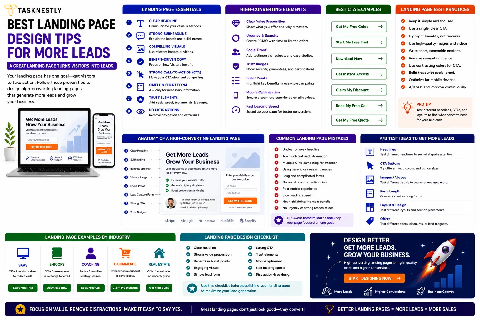
Landing Page Design Tips: Start With Message Match
The first and most important of all landing page design tips is message match — ensuring that the headline and key message on your landing page directly mirrors the ad, email, or social media post that drove the click.
When a visitor arrives after clicking an ad that promised “Free SEO Audit for Your Website,” they should see exactly that promise reinforced immediately in the headline. If they arrive and see a generic homepage or a page about your wider services, the disconnect causes instant confusion and abandonment.
Message match is one of the most commonly violated landing page best practices, and it is responsible for a significant proportion of wasted ad spend across the industry. Every source of traffic driving to your landing page should have its own version — or at minimum, a headline that directly mirrors the promise of that traffic source. This single landing page design tip can double conversion rates without changing anything else about the page.
Write a Headline That Does the Heavy Lifting
Among the most critical landing page design tips is the headline — the first thing every visitor reads and the primary determinant of whether they stay or leave. A strong landing page headline does three things: it confirms the visitor is in the right place, it communicates the primary benefit of your offer clearly, and it compels the visitor to keep reading. Landing page best practices for headlines consistently show that specific, benefit-led headlines outperform clever, vague, or question-based ones.
“Get More Leads From Your Website — Without Increasing Your Ad Budget” is a strong landing page headline. “Welcome to Our Services Page” is a landing page design mistake. The headline should be the clearest possible expression of the single most important reason someone should take your offer.
Growing An Online Store?
The right AI marketing tools can automate ads, emails, and product promotion for your store. See which ones are actually worth paying for.
See AI Marketing Tool Reviews →Building Your Site Yourself?
AI coding tools can speed up development dramatically. Compare the best ones before you commit to a stack.
See AI Coding Tools →Your Site Should Be Converting More
Small fixes only go so far — Tasknestly builds and optimizes full websites designed to convert visitors into customers.
Get Website Services →High Converting Landing Page Elements: Above the Fold
One of the most important landing page design tips in conversion optimisation is optimising your above-the-fold content — everything visible without scrolling — because this is what the majority of visitors will see before deciding whether to continue. High converting landing page elements above the fold include a strong headline, a supporting subheadline that adds specificity, a clear image or visual that supports the offer, and a prominent call to action button.
Landing Page Conversion Tips for Your Hero Section
Your hero section — the above-the-fold area — should communicate your entire value proposition at a glance. A visitor should be able to understand what you offer, who it is for, and what they need to do next within five seconds of landing.
Landing page conversion tips for the hero section include keeping copy concise (headlines under 10 words, subheadlines under 20), using a visual that shows the outcome rather than the product, and making the CTA button large, high-contrast, and impossible to miss.
Avoid cluttering the hero section with multiple competing messages. Every element above the fold should serve one purpose: convincing the visitor to scroll further or click the CTA. Landing page design tips that pile multiple offers, navigation menus, and social links above the fold consistently underperform pages that maintain a single, clear focus.
Growing An Online Store?
The right AI marketing tools can automate ads, emails, and product promotion for your store. See which ones are actually worth paying for.
See AI Marketing Tool Reviews →Building Your Site Yourself?
AI coding tools can speed up development dramatically. Compare the best ones before you commit to a stack.
See AI Coding Tools →Your Site Should Be Converting More
Small fixes only go so far — Tasknestly builds and optimizes full websites designed to convert visitors into customers.
Get Website Services →Landing Page Best Practices for Trust and Credibility
Even the most beautifully designed landing page will fail to convert if visitors do not trust the brand behind it. Building trust is one of the most important clusters of landing page design tips — and it requires deliberate, specific implementation of social proof, credibility signals, and risk reduction elements throughout the page.
Use Social Proof Strategically
Among the most impactful landing page design tips for conversion is the strategic placement of social proof — testimonials, reviews, client logos, case study results, and user counts. Social proof reduces the perceived risk of taking action by showing the visitor that other people have taken the same action and benefited.
Landing page best practices for social proof include placing a strong testimonial directly below the hero section (where trust needs to be established early), using specific and outcome-focused testimonials rather than generic praise, and including a face and name alongside every testimonial to signal authenticity.
Trust Signals and Risk Reversal
High converting landing page elements include risk reversal elements that reduce the psychological cost of taking action. A money-back guarantee, a free trial, a no-commitment consultation, or a clear privacy policy statement (“We never share your data”) all reduce the hesitation that stands between a visitor and a conversion. These landing page optimisation tips address the visitor’s unspoken objection — “what if this doesn’t work for me?” — before it can derail the conversion.
For independent reviews of the best landing page tools and conversion optimisation platforms, TechBothQ covers the leading solutions with detailed feature comparisons to help you choose the right build and test environment for your landing page.
Need a landing page that actually converts your traffic into leads and sales? Tasknestly’s web development and digital marketing team builds and optimises landing pages that deliver measurable results. Request your free quote.
Growing An Online Store?
The right AI marketing tools can automate ads, emails, and product promotion for your store. See which ones are actually worth paying for.
See AI Marketing Tool Reviews →Building Your Site Yourself?
AI coding tools can speed up development dramatically. Compare the best ones before you commit to a stack.
See AI Coding Tools →Your Site Should Be Converting More
Small fixes only go so far — Tasknestly builds and optimizes full websites designed to convert visitors into customers.
Get Website Services →Landing Page Design Tips for Mobile Optimisation
In 2026, the majority of traffic to most landing pages arrives on mobile devices — and yet a significant proportion of landing pages are still designed primarily for desktop and adapted for mobile as an afterthought. Landing page design tips for mobile-first optimisation are not optional; they are the foundation of any landing page that needs to convert in the real world.
Mobile Landing Page Design Tips
Key mobile landing page design tips include: ensuring text is legible without zooming (minimum 16px body text), making CTA buttons large enough to tap easily (minimum 44×44 pixels), eliminating horizontal scrolling entirely, ensuring images load fast and scale correctly on small screens, and placing the primary CTA in a position that is reachable by thumb without scrolling. These landing page conversion tips specifically for mobile can dramatically improve your conversion rate for the majority of your traffic.
Page load speed is arguably the single most important mobile landing page design tip of all. Google’s research consistently shows that conversion rates drop sharply with every additional second of load time on mobile.
A landing page that loads in under two seconds converts at a significantly higher rate than one that takes four or five seconds — which means page speed optimisation is one of the highest-return landing page optimisation tips available regardless of how strong the rest of your design is.
Growing An Online Store?
The right AI marketing tools can automate ads, emails, and product promotion for your store. See which ones are actually worth paying for.
See AI Marketing Tool Reviews →Building Your Site Yourself?
AI coding tools can speed up development dramatically. Compare the best ones before you commit to a stack.
See AI Coding Tools →Your Site Should Be Converting More
Small fixes only go so far — Tasknestly builds and optimizes full websites designed to convert visitors into customers.
Get Website Services →Landing Page Conversion Tips: CTA Design and Placement
Your call to action is the moment of conversion — and the design and placement of your CTA is one of the most studied areas of landing page best practices. These landing page design tips for CTAs are specific, evidence-backed, and immediately implementable.
CTA Copy That Converts
One of the most impactful landing page conversion tips is changing generic CTA button copy to specific, benefit-led copy. “Submit” converts poorly. “Get My Free Quote” converts better. “Start Growing My Business Today” converts best for the right audience. Landing page design tips for CTA copy consistently show that first-person, action-led, benefit-specific language outperforms passive or generic alternatives. Your CTA button should tell the visitor exactly what they are getting and why they should want it now.
CTA Placement and Repetition
High converting landing page elements include multiple CTA placements throughout longer pages — above the fold, after the key benefits section, after the testimonials section, and at the bottom of the page.
Landing page design tips for longer pages recommend repeating the same CTA at logical decision points throughout the scroll rather than placing it only at the top or bottom. Visitors who scroll are already showing intent — give them the opportunity to convert at every moment they are ready.
Remove Navigation and Exit Points
One of the most counterintuitive landing page optimisation tips is removing your site’s main navigation from the landing page entirely. Navigation gives visitors an escape route — a way to wander to other pages without converting. Landing page best practices consistently show that removing navigation from dedicated lead generation or sales landing pages improves conversion rates. The landing page should be a focused conversion environment where the only meaningful action is the one you want the visitor to take.
Growing An Online Store?
The right AI marketing tools can automate ads, emails, and product promotion for your store. See which ones are actually worth paying for.
See AI Marketing Tool Reviews →Building Your Site Yourself?
AI coding tools can speed up development dramatically. Compare the best ones before you commit to a stack.
See AI Coding Tools →Your Site Should Be Converting More
Small fixes only go so far — Tasknestly builds and optimizes full websites designed to convert visitors into customers.
Get Website Services →Landing Page Design Tips for Different Business Types
Not all landing page design tips apply equally across every business model. The landing page design tips that work best for a B2B professional services firm differ from those that work best for an ecommerce brand or a local service business. Understanding which landing page design tips are most critical for your specific business type helps you prioritise the changes that will have the greatest impact on your conversion rate.
Landing Page Design Tips for Service Businesses
For service businesses, the most important landing page design tips centre on trust and expertise. Service purchases involve higher perceived risk than product purchases — the buyer cannot see or test what they are buying before committing.
This means social proof, case studies, credentials, and specific outcome-led testimonials carry more weight than visual polish. Landing page design tips for service businesses also prioritise the discovery call or consultation CTA over direct purchase — the goal is often to start a conversation, not close a sale on the page.
Landing Page Design Tips for Ecommerce
Ecommerce landing page design tips focus more heavily on product presentation, urgency, and friction reduction. High-quality product imagery from multiple angles, clear pricing with any savings highlighted, urgency elements like stock levels or limited-time offers, and a minimal checkout flow are the highest-impact landing page design tips for ecommerce conversion. Social proof in the form of verified customer reviews directly adjacent to the product and CTA is especially powerful.
Landing Page Design Tips for Lead Generation
Lead generation landing pages — where the goal is capturing an email address or enquiry rather than a direct sale — benefit most from landing page design tips around offer clarity and form simplicity. The clearer the benefit of filling in the form and the fewer the fields required, the higher the conversion rate.
Landing page design tips for lead generation consistently show that single-field forms (email only) convert at significantly higher rates than multi-field forms. The offer — free guide, free audit, or free consultation — must be immediately and obviously valuable to the visitor.
Growing An Online Store?
The right AI marketing tools can automate ads, emails, and product promotion for your store. See which ones are actually worth paying for.
See AI Marketing Tool Reviews →Building Your Site Yourself?
AI coding tools can speed up development dramatically. Compare the best ones before you commit to a stack.
See AI Coding Tools →Your Site Should Be Converting More
Small fixes only go so far — Tasknestly builds and optimizes full websites designed to convert visitors into customers.
Get Website Services →A/B Testing: The Landing Page Design Tip That Compounds Over Time
All the landing page design tips in this guide are starting points — proven principles that give you a strong foundation. But the landing page design tip that produces the greatest long-term improvement is systematic A/B testing. Testing one element at a time — headline versus headline, CTA copy versus CTA copy, hero image versus hero image — and measuring the conversion rate impact of each change turns your landing page from a static asset into a continuously improving machine.
The discipline of A/B testing also forces you to apply all the other landing page design tips with genuine rigour. When you know you are going to measure the impact of a headline, you write the best possible headline rather than a reasonable one.
When you know you are going to test your CTA button colour, you actually implement and measure the high-contrast version rather than leaving it as an item on the to-do list. A testing culture is one of the most valuable things a business can build around its landing page.
This connects directly to the business goals that Tasknestly’s digital marketing strategy and website development services are built to serve. For ecommerce brands especially, applying these landing page design tips alongside professional ecommerce solutions creates a complete conversion system that turns traffic into revenue at the highest possible rate.
Top Tools to Help You Apply These Landing Page Design Tips
- Unbounce — Purpose-built landing page builder with A/B testing, AI copywriting assistance, and conversion analytics designed around the landing page best practices in this guide.
- Hotjar — Heatmap and session recording tool that shows you exactly how visitors are behaving on your landing page, making it easy to identify where conversions are dropping off.
- Google Optimize (via GA4) — Free A/B testing and personalisation tool that lets you test landing page design tips directly on your existing pages without a separate platform.
Growing An Online Store?
The right AI marketing tools can automate ads, emails, and product promotion for your store. See which ones are actually worth paying for.
See AI Marketing Tool Reviews →Building Your Site Yourself?
AI coding tools can speed up development dramatically. Compare the best ones before you commit to a stack.
See AI Coding Tools →Your Site Should Be Converting More
Small fixes only go so far — Tasknestly builds and optimizes full websites designed to convert visitors into customers.
Get Website Services →Frequently Asked Questions: Landing Page Design Tips
| Question | Answer |
|---|---|
| What are the most important landing page design tips for more leads? | The highest-impact landing page design tips are: message match between your ad and headline, a clear benefit-led headline, strong social proof above the fold, mobile-first design, fast load speeds, specific CTA copy, and removal of navigation menus. |
| How long should a landing page be? | Landing page length should match the complexity of your offer. Simple free offers or email sign-ups need short pages (one to two screens). High-ticket or complex offers need longer pages that cover benefits, objections, social proof, and FAQ content before the CTA. |
| What makes a high converting landing page? | High converting landing page elements include message match, a strong headline, clear value proposition, compelling social proof, risk reversal (guarantee or free trial), mobile optimisation, fast load speed, and specific CTA copy placed at multiple points throughout the page. |
| How do I improve my landing page conversion rate? | Start with the highest-impact landing page optimisation tips: check your headline for clarity and specificity, add a strong testimonial above the fold, improve page load speed, make your CTA button larger and more specific, and remove navigation. Then A/B test each change to quantify its impact. |
| Should every ad campaign have its own landing page? | Yes. Landing page best practices consistently show that dedicated, message-matched landing pages convert significantly better than generic pages. Each campaign, audience segment, or offer should have its own landing page that mirrors the specific promise of the traffic source. |
| How important is page speed for landing page conversion? | Extremely important. Every additional second of load time reduces conversion rate measurably. Landing page optimisation tips always include page speed because it is one of the highest-return technical improvements available — especially for mobile traffic. |
| Can I use my homepage as a landing page? | Not recommended. Homepages serve multiple audiences and purposes simultaneously, which dilutes conversion focus. Dedicated landing pages that speak to a specific audience, offer, and traffic source consistently outperform homepages as conversion destinations. |
Growing An Online Store?
The right AI marketing tools can automate ads, emails, and product promotion for your store. See which ones are actually worth paying for.
See AI Marketing Tool Reviews →Building Your Site Yourself?
AI coding tools can speed up development dramatically. Compare the best ones before you commit to a stack.
See AI Coding Tools →Your Site Should Be Converting More
Small fixes only go so far — Tasknestly builds and optimizes full websites designed to convert visitors into customers.
Get Website Services →Conclusion: Apply These Landing Page Design Tips and Watch Your Conversions Grow
Landing page design tips are not about decoration — they are about conversion. Every element on your landing page either earns its place by moving visitors closer to taking action or it is friction that is costing you leads.
The landing page design tips in this guide — message match, strong headlines, social proof, mobile optimisation, fast load speeds, specific CTA copy, and systematic A/B testing — give you a complete framework for building landing pages that convert at the highest possible rate.
Start by auditing your current landing page against these landing page design tips one by one. Identify the biggest gap — whether that is a vague headline, missing social proof, slow load speed, or a generic CTA — and fix it first. Then move to the next. Applying landing page design tips systematically over time produces compounding improvements that significantly increase the commercial return from every traffic source you invest in.
If you want a landing page built from the ground up using these landing page design tips — designed specifically for your audience, your offer, and your conversion goals — Tasknestly’s web design and development team is ready to help. Get your free quote today and let us build the landing page your business deserves.
Growing An Online Store?
The right AI marketing tools can automate ads, emails, and product promotion for your store. See which ones are actually worth paying for.
See AI Marketing Tool Reviews →Building Your Site Yourself?
AI coding tools can speed up development dramatically. Compare the best ones before you commit to a stack.
See AI Coding Tools →Your Site Should Be Converting More
Small fixes only go so far — Tasknestly builds and optimizes full websites designed to convert visitors into customers.
Get Website Services →Grow With Tasknestly
Subscribe to the Tasknestly newsletter and get the latest tips on websites, SEO, social media, and digital growth.