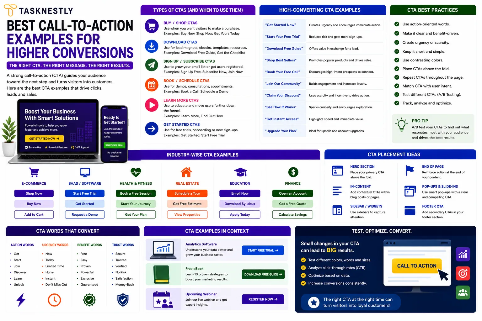
Call-to-action examples that genuinely convert are rarer than most people realise. Nearly every website, landing page, and email has a call to action — but the vast majority of them are generic, passive, and fail to motivate the visitor to do anything. The difference between a CTA that converts well and one that is simply present on a page is not visual design alone — it is a combination of specificity, placement, urgency, and the psychological understanding of what makes people take action at a specific moment.
The best call-to-action examples share characteristics that can be learned, applied, and tested systematically. Understanding what makes great call-to-action examples work gives you a framework for writing CTAs that perform across every format — landing pages, homepages, emails, social media, ads, and product pages. Poor call-to-action examples are generic, vague, and give the visitor no reason to act now. Great call-to-action examples are specific, benefit-led, and reduce the friction between interest and action to near zero.
This guide covers the best call-to-action examples across every major digital context — websites, emails, social media, and ads — explains the psychology behind why each one works, and gives you the framework to write high-converting call-to-action examples for your own business. Whether you are writing landing page copy, optimising an email sequence, or improving your website’s conversion rate, these call-to-action examples will show you exactly what great looks like.
Want conversion-optimised copy and CTAs built into your website? Tasknestly’s web design and digital marketing team builds pages with CTAs that convert visitors into leads and customers. Get your free quote today.
Growing An Online Store?
The right AI marketing tools can automate ads, emails, and product promotion for your store. See which ones are actually worth paying for.
See AI Marketing Tool Reviews →Building Your Site Yourself?
AI coding tools can speed up development dramatically. Compare the best ones before you commit to a stack.
See AI Coding Tools →Your Site Should Be Converting More
Small fixes only go so far — Tasknestly builds and optimizes full websites designed to convert visitors into customers.
Get Website Services →Table of Contents
What Makes Call-to-Action Examples Actually Work
Before looking at specific call-to-action examples, it is worth understanding the psychological principles that make CTAs convert — because without this foundation, even the best call-to-action examples will not produce consistent results when adapted for a different audience or context.
Specificity Beats Generality Every Time
The most consistent finding across high converting CTA examples is that specific language outperforms vague language dramatically. “Get My Free SEO Audit” converts at a higher rate than “Learn More.” “Start Saving Time Today” converts better than “Sign Up.” “Book My Free Strategy Call” converts better than “Contact Us.” The pattern in the best call-to-action examples is always the same: specific benefit, clear next step, immediate relevance to the visitor’s intent.
First-Person Language Creates Ownership
One of the most impactful CTA copywriting tips is switching button copy from second-person (“Get Your Free Quote”) to first-person (“Get My Free Quote”). Research by ContentVerve found that this simple change increased click-through rate by 90% in one test — because first-person language makes the visitor feel as if they are making an active choice for themselves rather than being directed by the brand. Look at any list of the best call-to-action examples and you will notice that first-person phrasing appears consistently among the highest performers.
Urgency and Scarcity Accelerate Action
Great call-to-action examples often include a genuine urgency or scarcity element that gives the visitor a reason to act now rather than “maybe later” — which almost always means never. Effective call to action phrases that create urgency include: “Limited spots available,” “Offer ends Friday,” “Only 3 places left this month,” and “Book before prices increase in July.” These urgency signals must be genuine to be effective — manufactured false scarcity damages trust and undermines conversion. But where genuine urgency exists, incorporating it into your call-to-action examples is one of the highest-impact CTA copywriting tips available.
Growing An Online Store?
The right AI marketing tools can automate ads, emails, and product promotion for your store. See which ones are actually worth paying for.
See AI Marketing Tool Reviews →Building Your Site Yourself?
AI coding tools can speed up development dramatically. Compare the best ones before you commit to a stack.
See AI Coding Tools →Your Site Should Be Converting More
Small fixes only go so far — Tasknestly builds and optimizes full websites designed to convert visitors into customers.
Get Website Services →Call-to-Action Examples for Websites and Landing Pages
Landing pages and website pages are where call-to-action examples have the most direct commercial impact, since these are the primary conversion destinations for paid and organic traffic.
High Converting CTA Examples for Service Businesses
For service businesses, the most effective call-to-action examples connect directly to the visitor’s desired outcome and make the first step feel low-risk. Here are proven call-to-action examples that consistently perform:
- “Get My Free Quote” — combines first-person ownership with a clear, zero-cost commitment
- “Book Your Free 30-Minute Strategy Call” — specificity (30 minutes) reduces commitment anxiety
- “See How We Can Help [Specific Outcome]” — positions the CTA as the start of a conversation, not a sale
- “Claim Your Free [Audit/Consultation/Assessment]” — the word “claim” implies value and exclusivity
- “Start Growing My Business Today” — first-person, outcome-focused, immediate
These call-to-action examples work because they communicate exactly what happens next, make the first step feel achievable, and frame the action in terms of the visitor’s benefit rather than the business’s need.
High Converting CTA Examples for Ecommerce
Ecommerce call-to-action examples have a different set of best performers — focused on reducing purchase hesitation and creating momentum toward checkout:
- “Add to Bag” (instead of “Add to Cart”) — softer language that reduces purchase commitment anxiety
- “Get It By [Specific Date] — Order in [X] Hours” — creates urgency with specific delivery promise
- “Buy Now, Pay Later” — reduces financial friction at the moment of decision
- “Only [X] Left in Stock — Order Now” — genuine scarcity drives immediate action
- “Try It Risk-Free for 30 Days” — risk reversal eliminates the biggest purchase barrier
The best ecommerce call-to-action examples address the specific fear or friction preventing the purchase — whether that is price concern, delivery uncertainty, or product quality doubt — and remove it directly at the CTA moment.
Growing An Online Store?
The right AI marketing tools can automate ads, emails, and product promotion for your store. See which ones are actually worth paying for.
See AI Marketing Tool Reviews →Building Your Site Yourself?
AI coding tools can speed up development dramatically. Compare the best ones before you commit to a stack.
See AI Coding Tools →Your Site Should Be Converting More
Small fixes only go so far — Tasknestly builds and optimizes full websites designed to convert visitors into customers.
Get Website Services →Call-to-Action Examples for Email Marketing
Email CTAs operate differently from website call-to-action examples because the reader is in a different context and mindset. Email readers are typically reading linearly in a distraction-filled environment, making clarity and single-mindedness even more important than on a landing page. The best call-to-action examples for email follow a simple rule: one email, one CTA.
Effective Call to Action Phrases for Email
- “Read the Full Guide →” — for content-driven nurture emails with clear directional arrow
- “Grab Your Spot Before [Date]” — event or webinar invitations with genuine deadline
- “Yes, I Want Early Access” — opt-in confirmation that uses enthusiasm-signalling language
- “See the Results for Yourself” — case study or testimonial emails that invite self-discovery
- “Start My Free Trial” — first-person, zero-commitment, outcome-implied
The most effective call-to-action examples for email are placed both as a text link within the email body and as a button at the bottom — giving readers two opportunities to convert without the CTA feeling forced or repeated. Button colour, size, and contrast matter in email CTAs just as they do on landing pages.
| CTA Context | Best Performing Examples | Key Principle |
|---|---|---|
| Landing pages | “Get My Free Quote”, “Start My Free Trial” | First-person + zero risk |
| Ecommerce | “Add to Bag”, “Get It By [Date]” | Specificity + urgency |
| “Yes, I Want Access”, “See Results” | Enthusiasm + curiosity | |
| Social media | “Save This for Later”, “Tag Someone Who Needs This” | Shareability + low friction |
| Pop-ups | “Yes, Show Me How”, “Claim My Discount” | Affirmative framing |
| Ads | “Get [Specific Outcome] — Free”, “Book Now” | Benefit-first + immediate |
Want CTAs and copy built specifically to convert your audience? Tasknestly’s digital marketing specialists write conversion-optimised copy across every channel — websites, emails, ads, and social. Book your free quote.
Growing An Online Store?
The right AI marketing tools can automate ads, emails, and product promotion for your store. See which ones are actually worth paying for.
See AI Marketing Tool Reviews →Building Your Site Yourself?
AI coding tools can speed up development dramatically. Compare the best ones before you commit to a stack.
See AI Coding Tools →Your Site Should Be Converting More
Small fixes only go so far — Tasknestly builds and optimizes full websites designed to convert visitors into customers.
Get Website Services →Call-to-Action Examples for Social Media
Social media call-to-action examples serve a different function from website CTAs — they primarily drive engagement, sharing, and traffic rather than direct conversion. But the best call-to-action examples for social media are highly intentional about which specific action they invite, because generic social media CTAs (“follow us for more!”) consistently underperform specific, low-friction ones.
Best CTA Examples for Instagram and TikTok
- “Save this for your next project” — triggers a save signal that boosts algorithmic distribution
- “Send this to someone who needs to hear it” — drives shares through social gifting motivation
- “Comment your answer below” — specific question that makes commenting easy and natural
- “Link in bio for the full guide” — drives profile visits and link clicks
- “Follow for a new tip every week” — value promise that justifies the follow action
Best CTA Examples for LinkedIn
- “Agree or disagree? Drop your take in the comments” — invites professional debate
- “Tag a founder who needs to see this” — drives shares through recommendation framing
- “DM me ‘GUIDE’ and I’ll send it over” — triggers direct messages and creates a warm lead touchpoint
- “Repost if this helped you” — explicit repost invitation with social altruism motivation
For independent analysis and comparison of CTA testing tools and conversion optimisation platforms, TechBothQ covers the leading options with in-depth reviews.
Growing An Online Store?
The right AI marketing tools can automate ads, emails, and product promotion for your store. See which ones are actually worth paying for.
See AI Marketing Tool Reviews →Building Your Site Yourself?
AI coding tools can speed up development dramatically. Compare the best ones before you commit to a stack.
See AI Coding Tools →Your Site Should Be Converting More
Small fixes only go so far — Tasknestly builds and optimizes full websites designed to convert visitors into customers.
Get Website Services →CTA Copywriting Tips: What to Avoid
Understanding the best call-to-action examples also means knowing which CTA approaches consistently underperform. These are the most common CTA mistakes that reduce conversion rates.
Generic verbs are the biggest culprit behind poor-performing CTAs. “Submit,” “Click Here,” “Learn More,” and “Go” are the weakest effective call to action phrases available — they tell the visitor nothing about what happens next or what they gain by taking action. Replace every generic verb in your CTAs with a specific, benefit-led alternative.
Multiple competing CTAs on a single page create decision paralysis. When a visitor faces five different button options, they are more likely to choose none than to choose one. The best call-to-action examples appear on pages with a clear primary CTA and at most one secondary CTA — and the hierarchy between the two is immediately visually obvious.
Mismatched CTAs undermine conversion by failing to reflect the visitor’s current stage of intent. A visitor reading an awareness-stage blog post is not ready for “Buy Now” — but “Download Our Free Guide” aligns with their current mindset. Matching your call-to-action examples to the visitor’s stage in the customer journey is one of the most important CTA copywriting tips for improving conversion rate across your entire site.
Growing An Online Store?
The right AI marketing tools can automate ads, emails, and product promotion for your store. See which ones are actually worth paying for.
See AI Marketing Tool Reviews →Building Your Site Yourself?
AI coding tools can speed up development dramatically. Compare the best ones before you commit to a stack.
See AI Coding Tools →Your Site Should Be Converting More
Small fixes only go so far — Tasknestly builds and optimizes full websites designed to convert visitors into customers.
Get Website Services →Call-to-Action Examples for Ad Campaigns
Paid advertising call-to-action examples operate under tight constraints — limited characters, intense competition for attention, and audiences who have not actively sought out your brand. The best call-to-action examples for ads are even more concise and benefit-front than their website or email equivalents.
Google Ads CTAs are typically limited to a handful of words in the ad headline or description, with platform-specific call to action extensions. The most effective call-to-action examples for Google Ads lead with the visitor’s desired outcome and include a clear signal of value: “Get Your Free Website Audit,” “Compare Quotes in 60 Seconds,” “Book a Same-Day Consultation.” The CTA in a Google Ad needs to earn its place by adding specific value beyond the headline — not simply restating the offer.
Meta Ads (Facebook and Instagram) give advertisers a dedicated CTA button alongside the ad creative. The built-in button options — “Learn More,” “Shop Now,” “Book Now,” “Get Quote,” “Sign Up,” “Download,” and “Contact Us” — are somewhat limited, making the ad headline and body copy CTAs even more important. The best call-to-action examples for Meta Ads use the copy to create desire and urgency, and align the button label with the specific action promised: if the copy says “Book your free strategy session,” the button should say “Book Now” rather than the generic “Learn More.”
Growing An Online Store?
The right AI marketing tools can automate ads, emails, and product promotion for your store. See which ones are actually worth paying for.
See AI Marketing Tool Reviews →Building Your Site Yourself?
AI coding tools can speed up development dramatically. Compare the best ones before you commit to a stack.
See AI Coding Tools →Your Site Should Be Converting More
Small fixes only go so far — Tasknestly builds and optimizes full websites designed to convert visitors into customers.
Get Website Services →Call-to-Action Examples for Pop-Ups and Exit-Intent
Pop-up CTAs are among the most debated elements in conversion optimisation — dismissed by many marketers as intrusive, but consistently producing meaningful conversion lifts when implemented thoughtfully. The best call-to-action examples for pop-ups are those that offer genuine value at precisely the right moment and make the opt-in feel like a discovery rather than an interruption.
Exit-intent pop-ups — triggered when the visitor’s cursor moves toward the browser close button — are particularly effective because they target visitors who are about to leave and have nothing to lose by making one final offer. The best call-to-action examples for exit-intent pop-ups address the specific reason a visitor might be leaving: price sensitivity (“Before You Go — Get 10% Off Your First Order”), information deficit (“Not Ready Yet? Download Our Free Guide First”), or commitment anxiety (“No Pressure — Book a Call Whenever You’re Ready”).
The language of the opt-out option in a pop-up CTA is a uniquely powerful CTA copywriting tip. Instead of a generic “No thanks” close button, high converting CTA examples use declined-offer language that subtly reinforces the cost of not taking action — “No thanks, I don’t want more leads” or “I’ll pass on the free guide for now.” This technique, used ethically and sparingly, can meaningfully increase pop-up opt-in rates by making the consequences of declining more vivid.
For time-limited offers, countdown timer pop-ups with specific CTAs like “Claim My 20% Discount — 4:37 Remaining” combine urgency, specificity, and first-person ownership in a single CTA that has proven highly effective across ecommerce and service businesses alike. The key is ensuring the offer and the deadline are both genuine — pop-up call-to-action examples that manipulate visitors with artificial urgency build short-term conversion at the cost of long-term trust.
Growing An Online Store?
The right AI marketing tools can automate ads, emails, and product promotion for your store. See which ones are actually worth paying for.
See AI Marketing Tool Reviews →Building Your Site Yourself?
AI coding tools can speed up development dramatically. Compare the best ones before you commit to a stack.
See AI Coding Tools →Your Site Should Be Converting More
Small fixes only go so far — Tasknestly builds and optimizes full websites designed to convert visitors into customers.
Get Website Services →How to Test and Improve Your Call-to-Action Examples
The best call-to-action examples are not discovered through intuition — they are discovered through systematic testing. A/B testing your CTAs is one of the highest-return optimisation activities available, because even a small improvement in CTA click-through rate compounds across every page where that CTA appears.
Test one variable at a time: CTA copy first (this has the highest potential impact), then button colour, then button size, then placement on the page. Run each test for long enough to achieve statistical significance — at least 100 conversions per variant before drawing conclusions. Track both click-through rate and downstream conversion rate, because a CTA that gets more clicks but attracts lower-quality leads is not necessarily a better CTA.
Combining strong call-to-action examples with professionally designed landing pages and a coherent digital marketing strategy creates a conversion system where traffic, CTAs, and landing page design all work together to maximise the commercial return from every visitor. For ecommerce businesses, pairing high-converting call-to-action examples with professional ecommerce solutions creates an end-to-end purchase journey optimised at every touchpoint.
Top Tools for Testing and Optimising Your Call-to-Action Examples
- Google Optimize (via GA4) — Free A/B testing tool for testing CTA copy, colour, and placement directly on your live pages with statistically valid results.
- Hotjar — Click maps and session recordings that reveal which CTAs visitors interact with and which they ignore, giving you data to prioritise your optimisation efforts.
- Unbounce — Landing page builder with built-in A/B testing and AI-powered Smart Traffic that automatically routes visitors to the best-performing CTA variant.
Growing An Online Store?
The right AI marketing tools can automate ads, emails, and product promotion for your store. See which ones are actually worth paying for.
See AI Marketing Tool Reviews →Building Your Site Yourself?
AI coding tools can speed up development dramatically. Compare the best ones before you commit to a stack.
See AI Coding Tools →Your Site Should Be Converting More
Small fixes only go so far — Tasknestly builds and optimizes full websites designed to convert visitors into customers.
Get Website Services →Frequently Asked Questions: Call-to-Action Examples
| Question | Answer |
|---|---|
| What are the best call-to-action examples for a service business? | The highest-converting call-to-action examples for service businesses include “Get My Free Quote,” “Book Your Free Strategy Call,” “Claim Your Free Audit,” and “See How We Can Help.” All lead with zero-risk first steps and first-person language. |
| Why do generic CTAs like “Submit” and “Learn More” underperform? | Generic CTAs give visitors no information about what they gain by clicking. The best call-to-action examples replace passive verbs with specific, benefit-led language that tells the visitor exactly what happens next and why it is worth doing. |
| How many CTAs should a landing page have? | A landing page should have one primary CTA repeated at logical points throughout the page — after the hero section, after social proof, and at the bottom. Multiple different CTAs create decision paralysis and reduce overall conversion rate. |
| What is the best CTA button colour? | There is no universally best colour — the most effective CTA button colour is whichever creates the highest contrast against your page background and stands out immediately from surrounding design elements. Test your specific brand colours against alternatives to find what works for your audience. |
| Should CTA copy be in first or second person? | First-person CTA copy (“Get My Free Quote”) consistently outperforms second-person (“Get Your Free Quote”) in A/B tests because it creates a sense of active personal choice. This is one of the most reliable CTA copywriting tips in conversion optimisation. |
| How do I write effective call to action phrases for email? | The best call-to-action examples for email are single, specific, and aligned with the email’s primary topic. Use enthusiasm-signalling language (“Yes, I want early access”), directional arrows (→), and text links within the copy in addition to the button CTA. |
| How often should I test my CTAs? | Run CTA tests continuously — always have at least one active test on your highest-traffic pages. Test copy first, then design elements. Review results after reaching statistical significance (typically 100+ conversions per variant) before implementing winning variants permanently. |
Growing An Online Store?
The right AI marketing tools can automate ads, emails, and product promotion for your store. See which ones are actually worth paying for.
See AI Marketing Tool Reviews →Building Your Site Yourself?
AI coding tools can speed up development dramatically. Compare the best ones before you commit to a stack.
See AI Coding Tools →Your Site Should Be Converting More
Small fixes only go so far — Tasknestly builds and optimizes full websites designed to convert visitors into customers.
Get Website Services →Conclusion: Use These Call-to-Action Examples as Your Starting Point
The best call-to-action examples are not one-size-fits-all solutions — they are frameworks and principles that you adapt for your specific audience, offer, and context. What connects all the high converting CTA examples in this guide is a commitment to specificity over generality, benefit over feature, and the visitor’s intent over the brand’s preference.
Start by auditing your current CTAs against the principles in this guide. Replace every generic verb (“Submit,” “Learn More,” “Click Here”) with a specific, benefit-led alternative. Switch from second-person to first-person copy. Add urgency where genuine. Ensure each page has one clear primary CTA. Then test systematically and let the data tell you which call-to-action examples resonate most with your specific audience.
If you want expert help writing and testing call-to-action examples across your website, landing pages, emails, and ads, Tasknestly’s digital marketing specialists are ready to help. Get your free quote today and let us build the conversion-optimised copy your business deserves.
Growing An Online Store?
The right AI marketing tools can automate ads, emails, and product promotion for your store. See which ones are actually worth paying for.
See AI Marketing Tool Reviews →Building Your Site Yourself?
AI coding tools can speed up development dramatically. Compare the best ones before you commit to a stack.
See AI Coding Tools →Your Site Should Be Converting More
Small fixes only go so far — Tasknestly builds and optimizes full websites designed to convert visitors into customers.
Get Website Services →Grow With Tasknestly
Subscribe to the Tasknestly newsletter and get the latest tips on websites, SEO, social media, and digital growth.